Friday, 9 December 2011

Digipak cover ideas


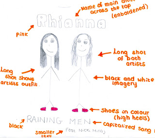
I originally planned to feature both artists within my digipak single cover. However, after researching into existing single covers that feature two artists, I found that only the artists who's album features the song being released is portrayed within the cover image. For example:


Rihanna features the song 'What's my name' on her album 'Loud'. The song features rap artist 'Drake'. In both released single covers above, Rihanna is the only artist to appear within the cover image.


Each of the above single covers also follow the same style. In comparison, each of them have an image of the main artist dominating the cover, the name of this artist and of the song being released, as well as 'Featuring...(name of artist featuring).
I therefore think I should follow this particular style when designing my own digipak.


When it comes to creating my actual digipak I will also be required to come up with my own names for the two artists, and so will not be using 'Rihanna' or 'Nicki Minaj'.

Main Artist

My main artist, Leonie, will be singing Rihanna's parts to the single 'Raining Men', which will feature on her album. Therefore my digipak will be for Leonie's album and will only feature pictures of her. Therefore, I needed to create a persona for Leonie.

Name: Robyn
I have chosen this name as I think have a one word name is more effective than using both a forename and a surname. It is sharp and somewhat different.
Age: 22
My artist is young and youthful, such as Rihanna, as this relates best to the audience listening to this type of music.
Twitter: OfficialRobyn

Digipak font ideas


I think for the majority of the text on my digipak I will use the large, bold text as I believe that this will stand out more when teamed with the images for my digipak. For the smaller aspects of writing I may use a more fancy style of font such as that of the fourth item of text shown above.

Thursday, 8 December 2011

Magazine advertisement analysis #3


This is an advertising poster promoting Kate Nash's debut album 'Made of Bricks'. The main image is of a detached cottage looking house, painted yellow. This image is perhaps used to reflect the name of the album, as a home is typically made of bricks. The colour yellow typically reflects positive and happy attitudes, as do the large daisy-looking flowers featured in front of the house. This overall image of a pretty, cosy looking house is reflected upon the audience, as they wish to own such a lifestyle and therefore own a house such as this. The positive, bright aura surrounding the image is also reflected on Kate Nash's album. Also in front of the house are hedge sculptures, something which we often associate with rich and wealthy homes, and those wishing for extravagance. Upon the winding path we see Kate Nash. She is wearing a floaty red dress and is walking away from the camera, however has her head turned backwards as though she is looking at and engaging with the audience. She is holding her dress up at either side, as people often do when they are about to courtsey, which also associates her with wealth and royalty, as does the rich red of her dress. This also makes her appear feminine. The red of the dress could also be associated with danger, and this may link with the black cat visable upon the roof of the house. This creates a certain mystery surrounding the home, intriguing the audience.

Her debut single 'Foundations' is displayed near the top of the advertisement, informing the audience that this song will be upon the album. This allows lovers of the song to become interested in purchasing the album. The name of the single 'Foundations' also links well with the poster and the album name, as it is the foundations which build a house. This overall idea of 'strong foundations' could link to Kate Nash's overall persona, in that she may be trying to portray herself as a strong, independant woman.

The white text of the poster stands out clearly upon the blue background, which doubles as the blue sky surrounding the house. The largest item of text is 'Kate Nash', which instantly allows the audience to recognise who the poster is for. NME magazine have also been quoted upon the poster calling Nash 'A bona-fide, proper pop star'. This positive reference to Kate Nash may also persuade the audience to purchase the album, which is further pushed by using a reference from a well known, popular magazine, which many people read.

Kate Nash's record label is also displayed at the bottom of the poster, as well as her website. This is conventional of album advertisements, as it allows the audience to find information on the artist. The number one album 'Made of Bricks' was released in 2007, and was Kate Nash's first (debut) album. Kate is signed to the record label 'Island Def Jam Motown Ireland Group', which is an umbrella label formed through merging the three labels 'Island Records' and 'Def Jam Recordings' (daughter companies of the Universal Music Group) and Motown Records.

Wednesday, 7 December 2011

Magazine advertisement analysis #2


This advertising poster is for Plan B's album 'The Defamation of Strickland Banks'. This is his second studio album and was released in 2010 through his record company Atlantic. Plan B is largely a hip-hop soul singer, and this is portrayed through his overall image.

Plan B wears a sharp, expensive looking suit, which links him both to the hip-hop aspect of his music, in that he looks as though his is wealthy, and to the soul genre in that he is smart. Within this particular image Plan B also holds a microphone that is often seen used by soul singers, and is not the typical microphone used by artists, in which they can detach from the stand. Plan B is looking away within the image, his face and body illuminated so that he stands out against the plain black background. This image makes it seem as though he is possibly performing when the picture is being taken.

There are three colours evident upon the this advertisement, those being red, white and black. The red colour is used on the largest item of text, which is Plan B's name, displayed at the very top of the poster in bold font, and on the capitalized text describing the album as being 'The multi-platinum album of the year', which ultimately creates a certain hype surrounding the album, forcing the audience to become intrigued as to why the album has earned this title. In bright white text is the name of the album, which has again been capitalized and emboldened in order to allow it to stand out. The white also contrasts against the black background making it clear and illuminated. The final item of text upon the advertisment is a list of different media texts and the number of stars they have rated the album. Ultimately every magazine has rated it four stars. Using this display of "star rated", the audience can see how other listeners feel about the album. The audience are more likely to buy a four star album than a two star, and so with all ratings being four star, audiences are especially likely to purchase the album in order to see if they enjoy the music as much as other listeners clearly have. Each of the companies who have rated the album are also fairly recognisable, such as 'Q' magazine. Therefore, buyers of these particular media texts may also purchase the album due to it being recommended by something which they already purchase and enjoy.

Also upon the advertisement, in the bottom left-hand corner, is a thumbnail image of the actual album cover. This will help the reader to recognise what the album cover looks like in order to make them more likely to purchase it if they happen to see it on the shelf. Also at the bottom of the advertisment are conventional aspects such as Plan B's website address and the logo for his record company. This allows readers who may not be familiar with the artist to research him on the internet and gain more knowledge and interest within his music.

I think the audience for this particular advertisment will mainly be those who purchase and read the media text which featured the poster, however will have been mostly viewed in detail by fans of Plan B. I think due to his overall style of music, Plan B will attract a slightly more mature audience of 17-26, due to his mix between r&b/hip-hop and soul music.

Magazine advertisement analysis #1


This particular magazine advertisement is largely dominated by the black and white image of Janet Jackson, in which she is marketing her come-back album 'Discipline'. Within the image, Janet is wearing long, black leather gloves upon which her name and the name of her album have been written in white paint. This white stands out against the black of her gloves, making it clearly visable as to what she is trying to advertise. The shot is a mid-shot of Janet, who is looking directly into the camera as though she is engaging with the audience. Janet is wearing leather, or PU type clothing, which often represents sexual ideas and connotations. The way in which she is holding her arms across her body somewhat portrays that she is trying to tone down this sexuality slightly. Along the bottom of the advertisement is a black band. Upon the black band is white text, which agains contrasts and stands out in order to make it clear to read. The largest item of text spells out 'JANET JACKSON IS BACK', with her name being enboldened in order to highlight it further. Beneath this text is information on the album, such as it's name and featured tracks previously released as singles. This technique is used in order to attract a wider audience, such as those who may recognise one of her singles and therefore purchase the album in order to sample the rest of her work. Also featured within the band of text is a quote from 'Touch' magazine stating 'She's got her groove back'. This makes the audience excited for her comeback and intrigued to see what the hype surrounding her new album is all about. Other items of text include Janet's website address and a logo for her record label. There is also text informing us of how many Grammy's Janet has aquired and that she was once Oscar nominated, suggesting, perhaps to those who haven't before purchased her music, that her work is worth listening to.
The overall advertisment is fairly simple and minimal, however is very effective as it makes is intrigued and interesting, almost forcing us to buy the album.

I think audiences of this particular advertisment will be readers of the magazine in which the poster was inserted within, and will therefore not be focused solely on fans of Janet Jackson. I think that Janet's fans will be of a slightly older audience, as she is not a particularly new artist and so may not be recognised by younger audiences. However, as Michael Jackson's sister, I think that she will also have a large audience following his death.

'Discipline' was released in February 2008, being Janet's tenth released studio album. At the time of release Janet was signed to the record label 'Island Records', a daughter company of 'The Universal Music Group'.

Tuesday, 6 December 2011

Digipak analysis


This particular digipak comes from Rihanna's fifth studio album 'Loud', released in 2010 by her record label Def Jam Recordings. The digipak features two disks, a digital booklet and various images. The most dominant colour featured within the digipak is red. This particular colour, under this circumstance, is clearly associated with passion and love. The main image of the digipak is that of the front cover, in which we see a close-up of Rihanna's face. She is not looking into the camera, but is instead looking downwards, allowing us to see her long eyelashes. Her lips, which are painted deep red in colour, are slightly parted. This particular pose emphasises Rihanna's sexuality and the passion in which she is trying to portray. Filling the rest of the cover is Rihanna's hair, which has been loosely curled so that it flows freely around her face, creating a feminine look. Rihanna's hair is also bright red in colour, creating an image for Rihanna which is instantly recognisable.

The digipak is split into three sections when opened. Usually, each section holds a different photo or a different item of text. However, in this particular digipak, a singular photo has been spread out between each of three sections, so that when it is opened we can see the full scene being portrayed. Rihanna is laid upon a bed of roses. Roses are also referred to as the flower of love or passion, and are also coloured red in order to keep with the theme of the album. Rihanna wears a long, floaty white dress within this particular image. This makes her appear feminine and delicate, however may also refer to weddings, which in turn refer to love. There is no text featured upon the inside of the digipak. Rihanna is, again, not facing the camera within this image. Her head is tilted back and her eyes closed in order to create a passionate expression and body language.

The image on the front of the digital booklet is the same as that of the front cover of the album, which is often conventional. Inside of the digital booklet will be more images of Rihanna, probably associated with the feminine, passionate theme of the rest of the digipak. There will also be text, such as information on each song within the album (producers etc) or perhaps lyrics to the songs so that the audience can engage with the music. The disk art also keeps to the theme, as it shows an extreme close-up of a rose, showing the detail of its petals. The colour of the disks is not red, however it links with Rihanna's skin tone and uses pale tones of pinks and peaches in order to represent feminism and love.

Tuesday, 29 November 2011

Album cover analysis #3


This album cover somewhat goes against conventions of typical album covers. There is not a large close-up shot of the artist dominating the majority of the cover, but instead a large item of text doing the dominating. This item of text is the album name 'I Am Chipmunk', and is the only item of text upon the cover. Usually, the largest item of text upon an album cover is the artist name, however the name of the artist is not needed in a seperate item of text upon the cover, as the album name clearly informs us as to who the album belongs to - Chipmunk. The artist photo is seen as the smallest item upon the cover, and he is sat on top of the large item of text. Chipmunk portrays the hip-hop/rap genre within his style of clothing. He wears a baggy pair of jeans, a white and also slightly baggy tshirt, white trainers and a black leather jacket. This type of styling is often conventional of males within this type of music genre. The most dominant colour upon the cover is the orange/yellow colour of the background. This colour almost looks gold, which is a colour obsessed with wealth and fame, two aspects which are largely associated with the hip-hop genre. Overall, this album cover is fairly simple, however is very effective. We can see a slight spotlight illuminating the letters 'I AM CHIPMUNK', making a shadow appear and the black of the text stand out further in front of the coloured background.

I think the audience of this particular album would range from 16 - 23, due to the rap aspects of the album and the fairly mature topics sang about in the songs. However, due to the fact that Chipmunk himself is young, a more youthful audience can relate to him and his music.

Chipmunk is a hip-hop rapper and is signed to the record label 'Sony Music Entertainment UK'. This particular album 'I am Chipmunk' was his debut album and was released in 2009, reaching number 2 on the UK album charts. I think that, for a debut album, this particular album name is quite suitable, as it is almost as if he is introducing himself.

Album cover analysis #2


This album cover is taken from Lady Gaga's second studio album 'Born This Way', released on May 23rd, 2011. The album was released by Gaga's record label 'Interscope Records', and is largely under the dance-pop genre. However, the album also contains aspects of other genres within each of the songs, including heavy metal and rock and roll, and it is from this combination of genres that the album cover arises.
The main image of the front cover is a close-up shot of the artist, taken in black and white. The only item of colour within the picture is evidently Gaga's lips, which are a rich red colour. Her hair has been volumized in order for it to fill a large majority of the album cover. Her black eye make-up and her overall expression portray a fierce attitude. Her lips are parted her teeth portrayed in order to reflect aggression. The red of her lips represents passion or perhaps danger. Within the image, Gaga's hair reflects the lighting and has a silvery tint to it. This links to the rock image she is portraying, in that rock is often associated with bikers, metal and black. This also links with the back of the album, where a smaller image of Gaga is shown, this time a long shot. The image is that of a motorbike posing as Gaga's body, with the same image of her head used on the cover of the album, being placed on the end of the motorbike. This image is very abstract and somewhat strange, however is expected from Lady Gaga, due to her creative nature usually expressed within her styling and fashion choices.

The audience for this particular album will range from the age groups 14 -25, which is quite a wide range. I think this is due to Lady Gaga being quite a versatile singer in both her songs and her overall image and attitude, as she is quite a fun and different artist. Also Gaga's main genre influence is pop music, and this often has a wide range of audiences in that many people find pop music to be one of their guilty pleasures.

The title of the album 'Born This Way' also links with the images found of the cover of the album. Gaga is representing herself to be different and odd, yet her album title is suggesting to the audience that she was born this way, and she is proud. This is also the name of one of her songs upon this album. Both the title and the name of the artist are displayed in the top left-hand corner, in small font. This allows the image to stand out the most upon the cover. This also suggests that potential buyers can recognise her as an artist without her name being enboldened and displayed in large text.

Album cover analysis #1


Rihanna's body langauge within this image portrays power and dominance. The close-up shot makes the image the most dominant aspect of the album cover, and the bright white background contrasts against the image in order to make it stand out further. Rihanna's head is slightly tilted downwards, however her eyes are staring upwards and directly into the camera, which creates a level of intensity. Riahnna's lips are painted red in order to portray her edgy nature and her sexuality. Her hand is placed upon her head in order to allow us to see that her nails are also painted red, but more importantly, to allow us to visualise the tattoo that spells out the name of her album.

'Talk That Talk' is the sixth studio album released by Rihanna. The album was released this month (November, 2011). Talk That Talk debuted at number one on the UK Albums Chart, selling more than 160,000 copies in its first week. With the album and her first single released from the album, 'We Found Love' both at number one during the same week, it made Rihanna the only female artist in the UK to simultaneously have a number one single and album twice in the same year a different album and single. The album was released by Rihanna's record label 'Def Jam Recordings'.

The audience of this particular album will be fans of Rihanna, and therefore fans of the hip-hop genre. This particular album is a slightly edgier take on the music normally produced by Rihanna, and I therefore think that the age range of those who would buy and listen to the album will be slightly old than those who bought her previous albums; possibly 17-24.

This album cover represents sexuality and stereotypes of the hip-hop genre. Rihanna's overall expression presents a suggestive nature, through the way in which she has her tongue slightly sticking out of her mouth in order to make it seem as though she is licking her lips, which is a fairly provocative action. The tattoo on her arm, teamed with the several rings upon each of her fingers represent stereotypes of the hip-hop genre. People often associate this genre with tattoo's and lots of thick, mostly gold, jewellery in order to represent wealth and success. In the top left hand corner of the cover is Rihanna's recognised logo 'R'. The letter is obviously used due to it being the first letter of her name, and is written in an edgy text, pointy and sharp, to link with the content of the album and the image upon the cover.

Thursday, 24 November 2011

Codes and Conventions

Each of the promotional and marketing techniques used by artists in order to distribute their music have various different conventions that link with the genre of the music.

Codes - different signs that create different meanings, e.g. the colour red often codes for danger
Conventions - aspects that are expected within a media text

Both of these aspects are used to enable people to familiarise themselves with different genres in order to separate these genres from one another in order to tell them apart.

Music Videos
Music videos often include various different conventions as a whole, these include:
- Aspects of performance, in which we see the artist or band performing the lyrics towards the camera. In music videos this often involves mime, and it is slightly more typical of bands to include musical instruments such as guitars or drums within their performances.
- Narrative-based performances. These performances fit widely within a storyline, which ultimately links with the lyrics of the song and therefore the story in which it is tyring to portray. We often see narrative within slightly less upbeat songs.
- Cinematography. The camera movements and shots often relate to the genre of the music. For example, slow tempo songs often feature more close-up shots than long shots in order to show emotion within the performers face and allow the audience to see their expression. More upbeat songs feature more long shots than close-up in order to show the artist dancing etc.
-Editing. The editing of music videos is often used in order to reflect the beat of the music. For example, up-beat songs will feature editing within their music videos that includes short, snappy cuts of different shots. Slower songs will feature shots that play for a longer duration.
- The mise-en-scene. Different genres includes very different props, costumes, lighting, sound and colour within their music videos. The hip-hop genre includes typical props that are conventional to this particular type of music, such as cars, girls, and lots of gold, which is also incorporated into the costumes of the artists, who often wear very small, ellaborate outfits within their video in order to represent their confident image. The sound within the hip-hop genre is largely non-diagetic due to them largely being performance based, however in some narrative based videos diagetic sound creeps in through the music in order to emphasise the story line by adding dialogue into the video. Lighting within the hip-hop genre is fairly bright and flashy, whereas in slower, more emotional songs the lighting is slightly dimmer.

Album Covers
General conventions of an album cover include:
- The name of the artist/band in the largest font upon the cover; this is to ensure that the text stands out and to enable potential buyers to instantly recognise who the album belongs to.
- The name of the album. Conventionally, this is usually written in a slightly smaller font than that of the artists name.
- An image of the artist or band. If the album belongs to only one artist then the image is usually a close-up shot of the artists face. This makes the performer the most dominant aspect of the album cover, which allows the audience to recognise who the album belongs to and makes the artist look dominant. Covers for a bands album usually feature a long shot of all the members of the band, with the lead singer standing in the middle of the group.
The images of album covers usally represent the image of the artist. For example, the image includes conventions of the genre that artist belongs to, but also the type of image that they, as individuals, wish to portray.


The above image is a shot of the cover of rihannas fifth album 'Loud'. This image portrays Rihanna's image in that she is a very attractive female who often portrays sexual connotations within her lyrics and her image. We often see Rihanna scantily clad singing songs that have hidden meanings. This album cover portrays this image in many ways. For example, Rihanna's hair and lips are both coloured in deep red. Red often codes for passion and love. Rihanna's lips are also parted slightly within the image, which is often seen as a provacative action, and her eyes are closed to allow us to see her long eyelashes, which emphasise her femininity. We cannot see any clothes within the image, but can instead see the skin of Rihanna's neck and shoulder. Upon her neck, we can also see evidence of a tattoo; an aspect of the hip-hop genre which is often seen to be conventional.


The above image here is of the band The Saturdays, who belong to the Pop genre in terms of their music. The name of the band is written in a large font across the top of the cover, and beneath is the image of the band. The image is shot in black and white, however is edited to show each of the five girls outfits in colour. Bright colours are conventional of the pop genre, and so this image helps to show how they stand out against the crowd.

Tuesday, 22 November 2011

Costume Ideas

I have researched into the outfits that artists within my chosen genre typically wear within their music videos. It is these kind of styles that will influence the costumes and styling that will appear within my own music video.


It seems that costume and styling within modern hip-hop music videos is fairly elaborate. I like the idea of having bright makeup that stands out around the eyes and will therefore use this idea on my own performers. I also like the idea of having neutral outfits in black or white, with a touch of colour in the form of an accessory, such as the shoes or coloured tights. I will therefore use this either in my video or within the images for my digipak.

Styling is important in order to portray the genre and individual images of particular artists. Their clothing and makeup needs to represent the type of music they are releasing and performing. For example, if a hip-hop artist were to dress in clothes normally associated with the rock/indie genres, such as all black clothing, then we would not link them with the hip-hop genre, even if their music clearly portrays all the conventions of the genre.

Styling is also used to create an individual persona to surround the artist. We often see these images change and develop over time, as their music grows and peoples tastes become more modernised. This also reflects how their music changes as their audiences begin to mature. A good example of this would be Rihanna. Her image has changed dramatically over time, as her music has become more edgy.


We can see that Rihanna began her career as a typical female artist with long flowing hair. She seems somewhat younger and more innocent within the first image seen above. Within the second photo, Rihanna's image has not changed drastically, although her styling seems to have become more prominant in that she seems to be wearing more makeup and has dyed her hair a darker shade of brown. The third image is more of a drastic stylistic change. Rihanna's long hair has been cut into a short choppy bob, and has been dyed black. We can see from other images that Rihanna's hair did become shorter than this, cut into a pixie style bob. More recently, Rihanna grew her hair and dyed it a bright shade of red and changed her clothing style back into feminine dresses. From here, however, she seems to have become more risque. Her music has become more edgy and sexual, as has her look. Rihanna has developed her old hair colour of plain brown again, however has changed her outfits to revealing shorts and dresses, with crop tops to show off her stomach.


We can tell by looking at artists that audiences project a performers image onto themselves. By looking at Rihanna, we are able to recognise that around the time in which Rihanna adopted the bright red hair colour, many fans and other artists also adopted the same style.
It is these small changes to styling, such as hair colour, that enable artists to change their images as a whole.

Saturday, 12 November 2011

Experimenting

I have experimented with various different elements I wish to include within my music video. The first aspect I have tested is the dance scene, which involves several dancers in the dark, holding torches to illuminate their movements. I wanted to test this idea in order to establish whether the scene would work without any additional lighting and if it would look effective on camera. These are the resulting videos from this experiment.

1)


2)


The first video was filmed in a room with no additional light other than that of the torch. The second video has a small amount of lighting to the side of the person holding the torch. I feel that this video worked best as I can make out the outline of the person holding the torch, unlike within the first video where the only thing visible is the light from the torch. Within my actual video I shall therefore use a slight aspect of additional lighting in order to make visible the silhouette of the dancers. I will use slightly more light intensity than in these video's, however, as neither of them worked particularly well to acheive the exact scene I had imagined.

The second test was simply to establish different backgrounds. A lot of my video will include plain backgrounds in order to contrast with the artist so that they stand out the most within a shot. I took various images of someone against several different backgrounds. I decided that this shot would work best within my video.

However, I also experimented with editing of this particular background in order to see if I could make it look even more effective and constrasting. I used Photoshop in order to adjust the colours and contrasts of the image and to change the colour of the background. Here were the results of my editing:

Friday, 11 November 2011

Script

My song begins with a two second interlude that includes no lyrics, just a snappy beat. There are four beats included within this two second span, and for each o.5 second I shall simply flash the colours pink and yellow alternatively. At 0.02 seconds the song begins. The first lyrics are 'Eenie, meenie, minie, mo', each word being sung one second after the previous. Therefore, for each 'one second' word I shall display a medium close-up shot of four different males. At 0.05 seconds I shall cut to a medium close-up of one of my performers, who will perform the lyrics to the camera. My video will then cut to a long shot of the same performer in order to show establish her outfit, and therefore her overall image, at 0.08 seconds, whilst she continues to perform the lyrics. At 0.11 seconds the chorus begins. My second performer will then be introduced, again in a medium close-up shot of her face, as she performs the lyrics. At 0.13 seconds the camera will pan out to a long shot of both performers who will dance spontaneously for 12 seconds. Each of these shots will be performed against a plain background which will be either yellow, pink or white in colour.

The first verse begins at 0.26 seconds. This shot will consist of a medium close-up of my second performer. In front of her will be a close-up of a males back, establishing a scene where the performer is talking up to the male, establishing her dominance and making a stand. The male will be positioned towards the right hand side of the shot, and the female centered in order to, again, establish her dominance within the shot, but to also ensure that we can see her emotions and watch her performing the lyrics. At 0.38 seconds the numbers '2 x 5' will be displayed across the screen, in a large font and emboldened in order to make it stand out. This will be in time with the lyrics 'All you need to know that i'm a two times five'. At 0.41 seconds the camera will cut to a shot of the performer again, however this time she will be holding a plastic pink gun in a long shot. At 0.43 seconds the camera will film the performer blowing 'smoke' from the end of the gun and the word 'Boom' will appear across the screen. At 0.44 seconds the camera will cut to a shot of the performers feet. Along with the lyrics 'Set your standards lower bow you're aiming too high', the camera will pan upwards until eventually we reach a medium-closeup of the artsist face as she performs the lyrics 'you're aiming too high'. At 0.47 seconds the camera will pan outwards to shot a long shot of the performers standing in the middle of two males. As she performs the lyrics 'so (huh) goodbye' she will push the male on her right hand-side out of the shot.

At 0.50 seconds the words 'Eenie, meenie, minie, mo' are again sung, and as each of these words are sounded, they will be displayed across the screen for one second each, again enboldened and written largely. At 0.53 seconds the first performer will be displayed in a medium close-up shot in the dark, her face eluminated by a spotlight so that we can see her expression and watch her mouth perform the lyrics. At 1.00 minute the performer will change to the second female, also performing the lyrics in the dark with a spotlight upon her face. The camera will then cut to a shot of four dancers, including the two performers, all still surrounded by the dark. This time, the only aspect of light within the scene will be from the large torches that each of the four will hold within their hands. We will be able to see their movements from the movement of the torches, and will be able to the see only the outline of their bodies. At 1.12 minutes both performers will lift the torches above their heads, shining the light upon their faces so that we can see them both perform the last lyrics of the chorus. At 1.15 minutes I will cut to a shot of both of the performers, back against a bright background, with the words 'OH YEAH YEAH' displayed across the screen. The words will then disappear at 1.16 but the performers will continue to dance within the long shot. At 1.17 the camera will zoom into an extreme closeup of one of the performers lips, singing the lyrics of the song. At 1.24 minutes the whole screen will be enveloped in the colour pink. Every 0.3 seconds the pink colour will turn to yellow, and then back to pink in sharp flashing movements until 1.27 minutes.

At 1.28 minutes the camera will cut to a medium close-up shot of the first performer, however she will be alligned to the left of the screen with a line on her right seperating her from the rest of the screen. After 0.3 seconds the the same shot will appear next to the first shot on the left, this time in the centre. After another 0.3 seconds a third shot will appear on the right to establish a shot with three medium close-ups of the same person seperated by two lines. This idea of split screeing will reflect the jump in the lyrics 'E-E-Excuse me'. The split screen will then dissolve into a single shot screen with a medium close-up of the same performer. At 1 minute 30 the camera will zoom out to a long shot and at 1.32 the performer will place her hand over her mouth in sync with the lyrics as they become more high pitched. At 1.36 the camera will zoom back into a medium close-up of the performer with a microscope across her right eye. At 1.38 the camera will cut to a close-up of a stereo speaker, from which the vibrations will represent the rhythm of the song and the lyrics 'dom dom dom...'. At 1.42 the camera will again cut to a long shot of the performer before quickly cutting to a shot of a stack of pound notes at 1.43. The lyrics 'long, long, long' are sung over a one second period, and for each 0.3 second the stack of notes quickly grows in size. This happens three times. At 1.44 the camera will cut to a long shot of a television. Upon the screen of this television will be the performer, performing the lyrics 'want my own TV production company' and she will also be within a long shot within the TV. At 1.48, whilst still filming the television in a long shot, the performer will be cut to a medium close-up within the screen. From 1 minute 51 to 1.53 the camera will film a long shot of the performer seated within a chair, performing the lyrics to the camera. At 1.53 the camera will cut to a medium close-up before zooming in again at 1.54 and again at 1.55, before zooming to an extreme close-up of the performers face at 1.56 whilst she asks the question to the camera 'really?' The camera will then cut back to the long shot of the performer still sat upon the chair, at 1.57, however this time towards the left and right of her will be two males. We will not be able to see their faces, though they shall both be holding champagne and cocktail glasses out to the performer. The performer will continue to perform the lyrics within this shot until 2 minutes 02.

At 2.03 the camera will cut to a long shot of the other performer who will dance within the long shot alone until 2.14, when the camera will zoom into a medium close-up of the performer. At 2.15 the screen will split into two, and the second performer will occupy the right hand side of the screen. The two performers will dance within their sections of the screen until 2.24. At 2.25 the colour of the background within each of the two sections of the screen will swap repeatedly six times until 2.27 lasting 0.3 seconds each.

At 2.28 the camera will cut to a new scene situated within a club. The second performer will be seated within the club surrounded by three or more other females, also seated within the long shot. In front of the group will be a table on which will be glasses and bottles of expensive looking alcohol in order to represent the club theme. The lighting will be dim. The performer will sing the lyrics towards the camera whilst looking as though she is engaging with her friends until 2.37 when the camera will cut to a close-up of a champagne bottle and glass to represent the lyrics 'I can buy my own drink'. At 2.40 the camera will cut to a medium close-up of the performer still sat within the club, performing the lyrics until 2.51.

At 2.52 the camera will cut to a shot of the rain falling upon the camera. After one second the camera will cut to a long shot of one of my performers in the rain, holding an umbrella. After another second the camera will cut to an extreme close-up of the top of an umbrella, and after a final second will cut again to a long shot of my second performer, also holding an umbrella, however this time with her back towards the camera and her arms held outright. This quick snappy shot-to-shot filming will be used to represent the lyrics 'Eenie, meenie, minie, mo'. The camera will then cut to a medium close-up of my first performer singing to the camera, at 2.56. At 3.01 the camera will cut to a medium close-up of the second performer also performing the lyrics to the camera. At 3.03 the camera cuts again to a long shot of both performers, stood in the rain with their closed umbrellas pointing towards the ground, dancing around them. This dancing will last for most of the duration of the chorus, until 3.13 when the next shot will appear of the second performer within a long shot, pointing her closed umbrella towards the camera as though she is pointing at the audience. At 3.15 the performer will open her umbrella and continue to dance in the rain. At 3.16 the camera will then cut to the same long shot, this time of the first performer. At 3.18 both performers will appear again on screen, within a long shot dancing in the rain. At 3.20 the camera will pan up the second performers body in order to show her outfit and her movement. This will happen in slow motion and will last for five seconds, until 3.25, when the camera has reached the performers face, the camera will cut to the same medium close-up of the first performers face, and will proceed to pan downwards of her body and outfit also until it reaches her heeled feet. The camera will then film, at 3.30, the performer kick her heels through a puddle, filming in slow motion the water flying through the air. At 3.34 the camera will cut to a long shot of both performers standing alongside one another, holding their umbrellas to the side and staring directly into the camera, before quickly cutting again to a closeup of the top of an umbrella which will ultimately be twirling around. At 3.38, as the song ends, the camera will cut to a shot of the rain falling one again upon the camera, before dissolving out.

Shooting Schedule


Here is the schedule that I wish to follow in terms of when and where I will be filming/taking pictures.


Thursday, 10 November 2011

Location

As most of my video will be filmed against an edited background of solid block colouring, there will be no great focus upon the location of my video. Instead, my video will be filmed against a plain white wall which will be easy to edit. The final scene of my video will be filmed within the rain. I wish to film this scene in an urban area.


In my bedroom at home, my walls are painted in cream. As this is a solid and pale colour, I can use this for various of my performance shots by standing the performers in front of the wall. Obviously, I will need to move the bed and remove the paintings from the wall.


This is the green room at college. If it is possible to get my two performers (who do not attend my college) into the green room then I would like to film the majority of my video here, as this allows for the best editing.


My garden. Towards the end of the video I may have my performers walking up and down the garden, possibly in the rain.


I may use the brick walls for my final shots, and have my two performers singing in front of these walls in order to create an 'urban' effect.


Here is another plain wall within my house. This particular room has a very large window opposite this wall, and so will give the best lighting. I will also need to manouvre some of the furniture in order to create the best space for filming.

Cast List

Within my music video there will be two female performers, both of whom will represent the lyrics from one of the original artists of the song each.
My first performer is Leonie Naylor, who will be representing the lyrics originally sang by Rihanna.


My second performer is Rebecca Cardell. Rebecca will represent the lyrics orignally rapped by Nicki Minaj.


I have chosen this pair for various reasons. Both girls are my best friends, and therefore I can rely on them not to pull out of filming at last minute, and to take my work seriously. Both girls also have the right image for my video, and will therefore work well within the video I am trying to produce.

Prop List

There are various props that I shall use within my video, including those that shall be directly used by the performers, and those that shall just form part of the overall mise-en-scene.

- Plastic gun.
I shall use a fake gun within one of the scenes of my music video. The gun will preferably be pink in colour in order to represent the feminism within the song and the video I am creating.

- Large torches.
Within the dance scene of my music video, each dancer shall hold a large torch in order to make their movements visable within the dark.

- Stereo speaker.
I shall film the speaker whilst it plays music in order to capture the vibrations of the prop so that they link with the rythm of the music.

- A variety of pound notes.
The stack of notes will gradually increase in sync with the lyrics of the song.

- Television.
My video shall be played upon the television to make it seem as though the performer is performing on television, inside of a television...

- Chair.
I shall use a plain chair covered in red fabric to create the illusion of a 'throne'.

- Champagne glassses.
These will be used to create the illusion of expense and luxury.

- Umbrella's.
These shall be used in the last scene of my video by both performers in order to represent the lyrics 'it's raining men'.