Friday, 9 December 2011

Digipak cover ideas


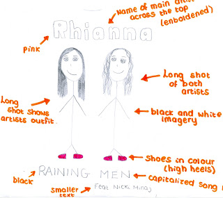
I originally planned to feature both artists within my digipak single cover. However, after researching into existing single covers that feature two artists, I found that only the artists who's album features the song being released is portrayed within the cover image. For example:


Rihanna features the song 'What's my name' on her album 'Loud'. The song features rap artist 'Drake'. In both released single covers above, Rihanna is the only artist to appear within the cover image.


Each of the above single covers also follow the same style. In comparison, each of them have an image of the main artist dominating the cover, the name of this artist and of the song being released, as well as 'Featuring...(name of artist featuring).
I therefore think I should follow this particular style when designing my own digipak.


When it comes to creating my actual digipak I will also be required to come up with my own names for the two artists, and so will not be using 'Rihanna' or 'Nicki Minaj'.

Main Artist

My main artist, Leonie, will be singing Rihanna's parts to the single 'Raining Men', which will feature on her album. Therefore my digipak will be for Leonie's album and will only feature pictures of her. Therefore, I needed to create a persona for Leonie.

Name: Robyn
I have chosen this name as I think have a one word name is more effective than using both a forename and a surname. It is sharp and somewhat different.
Age: 22
My artist is young and youthful, such as Rihanna, as this relates best to the audience listening to this type of music.
Twitter: OfficialRobyn

Digipak font ideas


I think for the majority of the text on my digipak I will use the large, bold text as I believe that this will stand out more when teamed with the images for my digipak. For the smaller aspects of writing I may use a more fancy style of font such as that of the fourth item of text shown above.

Thursday, 8 December 2011

Magazine advertisement analysis #3


This is an advertising poster promoting Kate Nash's debut album 'Made of Bricks'. The main image is of a detached cottage looking house, painted yellow. This image is perhaps used to reflect the name of the album, as a home is typically made of bricks. The colour yellow typically reflects positive and happy attitudes, as do the large daisy-looking flowers featured in front of the house. This overall image of a pretty, cosy looking house is reflected upon the audience, as they wish to own such a lifestyle and therefore own a house such as this. The positive, bright aura surrounding the image is also reflected on Kate Nash's album. Also in front of the house are hedge sculptures, something which we often associate with rich and wealthy homes, and those wishing for extravagance. Upon the winding path we see Kate Nash. She is wearing a floaty red dress and is walking away from the camera, however has her head turned backwards as though she is looking at and engaging with the audience. She is holding her dress up at either side, as people often do when they are about to courtsey, which also associates her with wealth and royalty, as does the rich red of her dress. This also makes her appear feminine. The red of the dress could also be associated with danger, and this may link with the black cat visable upon the roof of the house. This creates a certain mystery surrounding the home, intriguing the audience.

Her debut single 'Foundations' is displayed near the top of the advertisement, informing the audience that this song will be upon the album. This allows lovers of the song to become interested in purchasing the album. The name of the single 'Foundations' also links well with the poster and the album name, as it is the foundations which build a house. This overall idea of 'strong foundations' could link to Kate Nash's overall persona, in that she may be trying to portray herself as a strong, independant woman.

The white text of the poster stands out clearly upon the blue background, which doubles as the blue sky surrounding the house. The largest item of text is 'Kate Nash', which instantly allows the audience to recognise who the poster is for. NME magazine have also been quoted upon the poster calling Nash 'A bona-fide, proper pop star'. This positive reference to Kate Nash may also persuade the audience to purchase the album, which is further pushed by using a reference from a well known, popular magazine, which many people read.

Kate Nash's record label is also displayed at the bottom of the poster, as well as her website. This is conventional of album advertisements, as it allows the audience to find information on the artist. The number one album 'Made of Bricks' was released in 2007, and was Kate Nash's first (debut) album. Kate is signed to the record label 'Island Def Jam Motown Ireland Group', which is an umbrella label formed through merging the three labels 'Island Records' and 'Def Jam Recordings' (daughter companies of the Universal Music Group) and Motown Records.

Wednesday, 7 December 2011

Magazine advertisement analysis #2


This advertising poster is for Plan B's album 'The Defamation of Strickland Banks'. This is his second studio album and was released in 2010 through his record company Atlantic. Plan B is largely a hip-hop soul singer, and this is portrayed through his overall image.

Plan B wears a sharp, expensive looking suit, which links him both to the hip-hop aspect of his music, in that he looks as though his is wealthy, and to the soul genre in that he is smart. Within this particular image Plan B also holds a microphone that is often seen used by soul singers, and is not the typical microphone used by artists, in which they can detach from the stand. Plan B is looking away within the image, his face and body illuminated so that he stands out against the plain black background. This image makes it seem as though he is possibly performing when the picture is being taken.

There are three colours evident upon the this advertisement, those being red, white and black. The red colour is used on the largest item of text, which is Plan B's name, displayed at the very top of the poster in bold font, and on the capitalized text describing the album as being 'The multi-platinum album of the year', which ultimately creates a certain hype surrounding the album, forcing the audience to become intrigued as to why the album has earned this title. In bright white text is the name of the album, which has again been capitalized and emboldened in order to allow it to stand out. The white also contrasts against the black background making it clear and illuminated. The final item of text upon the advertisment is a list of different media texts and the number of stars they have rated the album. Ultimately every magazine has rated it four stars. Using this display of "star rated", the audience can see how other listeners feel about the album. The audience are more likely to buy a four star album than a two star, and so with all ratings being four star, audiences are especially likely to purchase the album in order to see if they enjoy the music as much as other listeners clearly have. Each of the companies who have rated the album are also fairly recognisable, such as 'Q' magazine. Therefore, buyers of these particular media texts may also purchase the album due to it being recommended by something which they already purchase and enjoy.

Also upon the advertisement, in the bottom left-hand corner, is a thumbnail image of the actual album cover. This will help the reader to recognise what the album cover looks like in order to make them more likely to purchase it if they happen to see it on the shelf. Also at the bottom of the advertisment are conventional aspects such as Plan B's website address and the logo for his record company. This allows readers who may not be familiar with the artist to research him on the internet and gain more knowledge and interest within his music.

I think the audience for this particular advertisment will mainly be those who purchase and read the media text which featured the poster, however will have been mostly viewed in detail by fans of Plan B. I think due to his overall style of music, Plan B will attract a slightly more mature audience of 17-26, due to his mix between r&b/hip-hop and soul music.

Magazine advertisement analysis #1


This particular magazine advertisement is largely dominated by the black and white image of Janet Jackson, in which she is marketing her come-back album 'Discipline'. Within the image, Janet is wearing long, black leather gloves upon which her name and the name of her album have been written in white paint. This white stands out against the black of her gloves, making it clearly visable as to what she is trying to advertise. The shot is a mid-shot of Janet, who is looking directly into the camera as though she is engaging with the audience. Janet is wearing leather, or PU type clothing, which often represents sexual ideas and connotations. The way in which she is holding her arms across her body somewhat portrays that she is trying to tone down this sexuality slightly. Along the bottom of the advertisement is a black band. Upon the black band is white text, which agains contrasts and stands out in order to make it clear to read. The largest item of text spells out 'JANET JACKSON IS BACK', with her name being enboldened in order to highlight it further. Beneath this text is information on the album, such as it's name and featured tracks previously released as singles. This technique is used in order to attract a wider audience, such as those who may recognise one of her singles and therefore purchase the album in order to sample the rest of her work. Also featured within the band of text is a quote from 'Touch' magazine stating 'She's got her groove back'. This makes the audience excited for her comeback and intrigued to see what the hype surrounding her new album is all about. Other items of text include Janet's website address and a logo for her record label. There is also text informing us of how many Grammy's Janet has aquired and that she was once Oscar nominated, suggesting, perhaps to those who haven't before purchased her music, that her work is worth listening to.
The overall advertisment is fairly simple and minimal, however is very effective as it makes is intrigued and interesting, almost forcing us to buy the album.

I think audiences of this particular advertisment will be readers of the magazine in which the poster was inserted within, and will therefore not be focused solely on fans of Janet Jackson. I think that Janet's fans will be of a slightly older audience, as she is not a particularly new artist and so may not be recognised by younger audiences. However, as Michael Jackson's sister, I think that she will also have a large audience following his death.

'Discipline' was released in February 2008, being Janet's tenth released studio album. At the time of release Janet was signed to the record label 'Island Records', a daughter company of 'The Universal Music Group'.

Tuesday, 6 December 2011

Digipak analysis


This particular digipak comes from Rihanna's fifth studio album 'Loud', released in 2010 by her record label Def Jam Recordings. The digipak features two disks, a digital booklet and various images. The most dominant colour featured within the digipak is red. This particular colour, under this circumstance, is clearly associated with passion and love. The main image of the digipak is that of the front cover, in which we see a close-up of Rihanna's face. She is not looking into the camera, but is instead looking downwards, allowing us to see her long eyelashes. Her lips, which are painted deep red in colour, are slightly parted. This particular pose emphasises Rihanna's sexuality and the passion in which she is trying to portray. Filling the rest of the cover is Rihanna's hair, which has been loosely curled so that it flows freely around her face, creating a feminine look. Rihanna's hair is also bright red in colour, creating an image for Rihanna which is instantly recognisable.

The digipak is split into three sections when opened. Usually, each section holds a different photo or a different item of text. However, in this particular digipak, a singular photo has been spread out between each of three sections, so that when it is opened we can see the full scene being portrayed. Rihanna is laid upon a bed of roses. Roses are also referred to as the flower of love or passion, and are also coloured red in order to keep with the theme of the album. Rihanna wears a long, floaty white dress within this particular image. This makes her appear feminine and delicate, however may also refer to weddings, which in turn refer to love. There is no text featured upon the inside of the digipak. Rihanna is, again, not facing the camera within this image. Her head is tilted back and her eyes closed in order to create a passionate expression and body language.

The image on the front of the digital booklet is the same as that of the front cover of the album, which is often conventional. Inside of the digital booklet will be more images of Rihanna, probably associated with the feminine, passionate theme of the rest of the digipak. There will also be text, such as information on each song within the album (producers etc) or perhaps lyrics to the songs so that the audience can engage with the music. The disk art also keeps to the theme, as it shows an extreme close-up of a rose, showing the detail of its petals. The colour of the disks is not red, however it links with Rihanna's skin tone and uses pale tones of pinks and peaches in order to represent feminism and love.