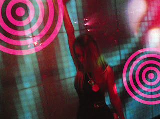
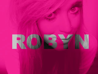
This is the final edit for my magazine advertisment. I used the same overall style as I used for my digipak, including the colours and fonts, as well as including the image of my final front cover.
Tuesday, 28 February 2012
Monday, 13 February 2012
Sunday, 12 February 2012
Friday, 10 February 2012
Editing Screenshots


On my final edit of my front cover, I applied a simply block white strip across the image of my artist. I then made the title of the album transparent so that the image of the artist could still be seen through this white strip. I did this by decreasing the opacity of the text only, using the layer toolbar in the bottom right-hand corner. For this, I decreased the opacity from 100% to 0%.
On top of the spray of colour, I used the 'Rainbow tool' which I selected from the top left-hand corner, from which it is called 'rainbow circle'. This tool allowed me to create various different effects and shapes by simply choosing an effect and drawing a line in the position I desired the effect to be in. I had to experiment with different colours and ways of sharpening my technique on this tool, however once I learnt how to use it effectively, I felt that it worked well with my digipak.


I also experimented with different patterns and styles for my CD discs. In the above image, using Photoshop, I selected 'filter-render-clouds' to create such an effect. However, I decided not to use these particular discs for my final digipak.
Saturday, 4 February 2012
Digipak Drafts #1
Within the following images I largely played around with the opacity tool within Photoshop. This allowed me to make text somwhat transparent, as in the first image, and allowed me to place a layer on top of another, without masking the one underneath entirely. The third draft image competed with my final edit in being my album's front cover. However, I opted for the more 'simply yet effective' approach, as I felt that this option may come across as being slighly too edited.


I also experimented with making different objects stand out in an image, as above. However, I felt that this particular style of image did not fit in with my 'R&B' genre.
Thursday, 2 February 2012
Health and Safety Considerations
When filming my music video, there where several considerations that I had to take into account regarding the safety of my two performers. These included:
- Wires
The wires from my camera proposed a visible breach of safety. As my performers were doing a lot of dancing and moving around during filming, they could have potentially tripped over these wire and harmed themselves. Therefore, during filming, I had to tape these wires down to the floor.
- Footwear
Also during filming, my two performers wear high heels. Therefore, we had to ensure that the floor on which they were dancing wasn't slippery, and that we limited movement within the heels as much as possible, to ensure that they didnt trip or cockle over.
Subscribe to:
Comments (Atom)


